What are you looking for?
- One UI Beta Programme
- :
- One UI 3
- :
- S20 | S20+ | S20 Ultra
- :
- Suggestions
- :
- Folder size/layout
Folder size/layout
- Subscribe to RSS Feed
- Mark topic as new
- Mark topic as read
- Float this Topic for Current User
- Bookmark
- Subscribe
- Printer Friendly Page
- Labels:
-
folders
-
Home Screen
22-10-2020 04:56 PM - last edited 22-10-2020 04:56 PM
- Mark as New
- Bookmark
- Subscribe
- Mute
- Subscribe to RSS Feed
- Highlight
- Report Inappropriate Content
Please let us change icon layouts or icon sizes for folders.
OneUI 2 and 2.5 had 4 icons across, and it was a vertical free-scroll.
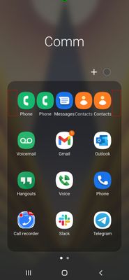
OneUI 3.0 is now 3 icons across, wasted space, icons too big, and a horizontal page scroll.
I can't find a way to change it, but much preferred the 4 icons across.
Can we have layout options like we do for home screen and app screen?
26-10-2020 07:21 AM
- Mark as New
- Bookmark
- Subscribe
- Mute
- Subscribe to RSS Feed
- Highlight
- Report Inappropriate Content
Hey @ryamoo,
I have shared this to our development team, so they will take a look at it 😊. Of course it would help if there were a lot of people supporting this idea by giving this suggestion a like! 😀
12-11-2020 12:57 AM
- Mark as New
- Bookmark
- Subscribe
- Mute
- Subscribe to RSS Feed
- Highlight
- Report Inappropriate Content
Add me to the list. I am irritated by the new layout every day. It is a huge step in the wrong direction and makes absolutely no sense. Even the four across we had before is dumb with the size of our phones. Give us the same options as the screen layout.
04-12-2020 01:17 AM
- Mark as New
- Bookmark
- Subscribe
- Mute
- Subscribe to RSS Feed
- Highlight
- Report Inappropriate Content
I signed up for this account so that I could reply to this message... are you kidding me? Did ANYBODY complain about the rows containing 4 apps in oneui 2-2.5? What was the reason for this change if nobody had a problem with the majority of their screen not being empty space? I literally measured it and you can fit an app icon in between each of the columns in this view. In fact, not only is there actually space for 5 icons, there's padding on the sides that could allow 5 icons to fit comfortably. I have no use for empty space, and furthermore I now have to relearn where the app buttons have relocated since I configured these home screen folders and they contained 4 columns of apps on my Samsung Galaxy S THREE...
I went ahead and attached an image showing just how ridiculous this change was and I am very interested to learn how this was considered an improvement...
04-12-2020 01:21 AM
- Mark as New
- Bookmark
- Subscribe
- Mute
- Subscribe to RSS Feed
- Highlight
- Report Inappropriate Content
As a software developer myself I GENUINELY do not understand how this made it out of the requirements and into the new UI... I literally don't use my app drawer because I've customized my home screen so well... so the option to customize the app drawer layout just causes me further irritation that someone actually thought this change was a good idea... massive step backwards for Samsung.
04-12-2020 10:02 PM
- Mark as New
- Bookmark
- Subscribe
- Mute
- Subscribe to RSS Feed
- Highlight
- Report Inappropriate Content
Just upgraded my S20 Ultra on Vzw. This is the only thing I don't like and it's absolutely maddening. I access a lot of my well organized apps through muscle memory and know I keep launching the wrong apps.
08-12-2020 01:44 AM
- Mark as New
- Bookmark
- Subscribe
- Mute
- Subscribe to RSS Feed
- Highlight
- Report Inappropriate Content
I created an account here just for the sake of saying I agree, the new icon spacing is ridiculous and makes zero sense whatsoever. It was very irritating to find that after upgrading from OneUI 2.5 to 3.0 that I now have a second page in some folders for NO reason other than someone thought it would be a great idea to waste valuable screen space to make icon spacing so large you could drive a school bus through it. At least if you're going to do this make the scaling configurable. The current layout is maddening.
08-12-2020 01:58 AM
- Mark as New
- Bookmark
- Subscribe
- Mute
- Subscribe to RSS Feed
- Highlight
- Report Inappropriate Content
I would realistically I appreciate the opportunity to contact a developer. I would really be interested to see the change request that explained why the UI needed to display 50% empty space. It is truly maddening that the only way that we can even make this request is through a community Forum that will likely never get to a developer.
08-12-2020 04:41 AM
- Mark as New
- Bookmark
- Subscribe
- Mute
- Subscribe to RSS Feed
- Highlight
- Report Inappropriate Content
Add me too. This is frustrating. I don't understand the logic behind the change. It is worse now.
08-12-2020 11:23 AM
- Mark as New
- Bookmark
- Subscribe
- Mute
- Subscribe to RSS Feed
- Highlight
- Report Inappropriate Content
Joined the Samsung community just to add that this annoys me as well!
Give me back my old folder view!
