What are you looking for?
- One UI Beta Programme
- :
- S23 / S23+ / S23 Ultra
- :
- Discussion
- :
- One UI 7 Feedback: S23 Ultra
One UI 7 Feedback: S23 Ultra
- Subscribe to RSS Feed
- Mark topic as new
- Mark topic as read
- Float this Topic for Current User
- Bookmark
- Subscribe
- Printer Friendly Page
13-03-2025 03:00 PM - last edited 13-03-2025 03:01 PM
- Mark as New
- Bookmark
- Subscribe
- Mute
- Subscribe to RSS Feed
- Highlight
- Report Inappropriate Content
Here is my comprehensive initial feedback of One UI 7 on S23 Ultra.
Pros:
- Feels fresh and new
- Smooth and fast performance
Cons:
- Contrast ratio appears off.
- UI element sizes are inconsistent. Some elements are too large, while others are too small. For example, the clock is larger compared to the WiFi and network icons.
- AOD displays notification icons in an unusual spot, disconnected from the status bar.
- The NavBar has the same alignment issue as the A56. It isn't centered between the shortcuts in AOD, leading to inconsistent placement.
- Nav Bar has missing animation from AOD to Lockscreen.
- The battery icon is noticeably larger than other status bar icons.
- No alphabetical order in the horizontal app drawer.
- Eye Comfort Shield is missing from the quick settings panel. In One UI 6, it was next to the dark mode option.
- Excessive top and bottom padding on the home screen. Adjusting the grid size doesn't help much.
- App suggestions glitches to the bottom in the recent apps menu.
- The notification row is slightly wider. Aligning everything in a single line would be better.
- Dark mode is too dark. The system widget looks awful with no transparency.
- The Device Care widget has padding issues.
- Clear button in the notification also clears sticky and live notifications (notifications which are not meant to clear like internet speed indicator, timer .etc.)
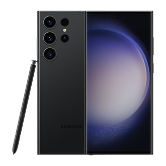
Products mentioned in this post
13-03-2025 03:20 PM
- Mark as New
- Bookmark
- Subscribe
- Mute
- Subscribe to RSS Feed
- Highlight
- Report Inappropriate Content
13-03-2025 09:04 PM
- Mark as New
- Bookmark
- Subscribe
- Mute
- Subscribe to RSS Feed
- Highlight
- Report Inappropriate Content
17-03-2025 10:01 AM
- Mark as New
- Bookmark
- Subscribe
- Mute
- Subscribe to RSS Feed
- Highlight
- Report Inappropriate Content
Hello @Poojan Patel,
Thanks for sharing your feedback! As for the bugs - Please also send an error report through Samsung Members app so that the developers can take a look at what may be the cause. And as for the suggestions regarding the UI - If anybody else would like to see these changes - please let us know in the comments. If it gathers a lot of support, I will pass these suggestions to the relevant team
Have a great day!
19-05-2025 04:54 PM
- Mark as New
- Bookmark
- Subscribe
- Mute
- Subscribe to RSS Feed
- Highlight
- Report Inappropriate Content
My biggest issue is with the padding at the top and bottom of the grid. This has made some of my widgets scale wrong and is a waste of usable space. It is like the grid is sized for the smaller phones and then they just slapped it on the big screen and use these huge margins to make up the difference. I also notice that there are larger margins on the sides. The widgets all seem to have margins from the edges of the grid resulting in smaller widgets. All in all, this has made my user experience worse.


