What are you looking for?
- One UI Beta Programme
- :
- One UI 3
- :
- S20 | S20+ | S20 Ultra
- :
- Suggestions
- :
- Re: Wasted folder space on homescreen
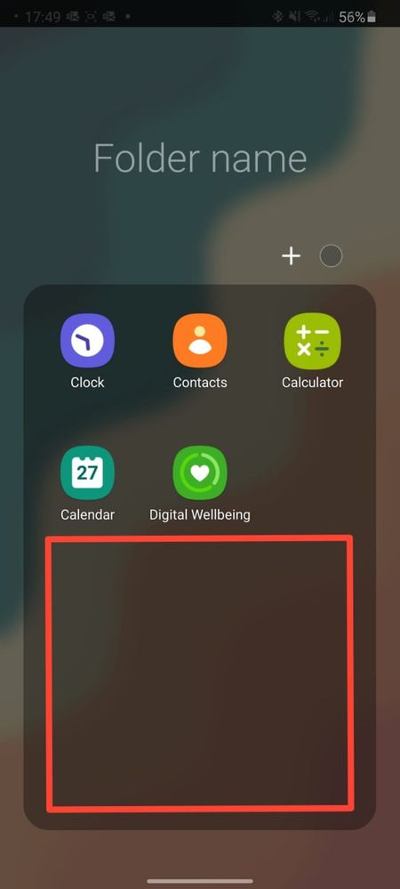
Wasted folder space on homescreen
- Subscribe to RSS Feed
- Mark topic as new
- Mark topic as read
- Float this Topic for Current User
- Bookmark
- Subscribe
- Printer Friendly Page
27-10-2020 05:59 PM
- Mark as New
- Bookmark
- Subscribe
- Mute
- Subscribe to RSS Feed
- Highlight
- Report Inappropriate Content

27-10-2020 06:27 PM
- Mark as New
- Bookmark
- Subscribe
- Mute
- Subscribe to RSS Feed
- Highlight
- Report Inappropriate Content
28-10-2020 02:25 PM
- Mark as New
- Bookmark
- Subscribe
- Mute
- Subscribe to RSS Feed
- Highlight
- Report Inappropriate Content
Thank you for sharing your opinion with us 😊. I'll forward your suggestion to our development team.
29-10-2020 03:18 PM
- Mark as New
- Bookmark
- Subscribe
- Mute
- Subscribe to RSS Feed
- Highlight
- Report Inappropriate Content
29-10-2020 11:20 PM
- Mark as New
- Bookmark
- Subscribe
- Mute
- Subscribe to RSS Feed
- Highlight
- Report Inappropriate Content
31-12-2020 10:01 PM
- Mark as New
- Bookmark
- Subscribe
- Mute
- Subscribe to RSS Feed
- Highlight
- Report Inappropriate Content
There is no reason for the folder header to take up 1/3 of the screen height. In addition to allowing configuration of the number of icons per row (3 is ridiculous!), fill from the bottom up (to improve one-handed usability), and allow icons to rise higher on the screen before forcing a second page. (Or at least make the amount of header space configurable)
