What are you looking for?
- One UI Beta Programme
- :
- One UI 3
- :
- S20 | S20+ | S20 Ultra
- :
- Suggestions
- :
- Re: Add separation between media and quick settings panel buttons
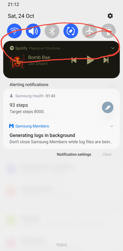
Add separation between media and quick settings panel buttons
- Subscribe to RSS Feed
- Mark topic as new
- Mark topic as read
- Float this Topic for Current User
- Bookmark
- Subscribe
- Printer Friendly Page
27-10-2020 02:42 PM - last edited 27-10-2020 11:55 PM
- Mark as New
- Bookmark
- Subscribe
- Mute
- Subscribe to RSS Feed
- Highlight
- Report Inappropriate Content

27-10-2020 03:08 PM
- Mark as New
- Bookmark
- Subscribe
- Mute
- Subscribe to RSS Feed
- Highlight
- Report Inappropriate Content
27-10-2020 05:05 PM
- Mark as New
- Bookmark
- Subscribe
- Mute
- Subscribe to RSS Feed
- Highlight
- Report Inappropriate Content
27-10-2020 09:33 PM
- Mark as New
- Bookmark
- Subscribe
- Mute
- Subscribe to RSS Feed
- Highlight
- Report Inappropriate Content
28-10-2020 12:32 PM
- Mark as New
- Bookmark
- Subscribe
- Mute
- Subscribe to RSS Feed
- Highlight
- Report Inappropriate Content
Thanks for your opinion! I'll forward your suggestion to our development team 😉. It would be better, indeed, if there was a wider separation between the toggles and the media that is playing underneath it!
29-10-2020 03:48 AM
- Mark as New
- Bookmark
- Subscribe
- Mute
- Subscribe to RSS Feed
- Highlight
- Report Inappropriate Content
